Sky’s the Limit Admin Message Center
Role
Design Lead
Focus areas
Research, Interactions, Prototyping
Project Overview
Skysthelimit.org connects underrepresented entrepreneurs with volunteer business professionals for free virtual mentorship. Its Member Experience team aims to form 1-on-1 relationships with each user – facilitating matches and celebrating milestones over time.
Objective:
For months, ME associates communicated frustration with the internal messaging software they use to do their jobs — sharing that it made their tasks time-consuming and overwhelming. So, leadership tasked me with improving the communication tool so that ME associates may respond to members promptly and efficiently.
I led this project during Q4 2021, working with multiple cross-functional teams, including one technical PM, six engineers, leads from Member Experience and Testing, and one UI designer.
The solution, which centralized all conversations and allowed ME to assign individual channels, was received well by the team. It made their workflows more efficient while keeping a human face on the member side.
Research
I conducted Usability Tests/Interviews (N=4) to understand better the goals and frustrations of the Member Experience team when managing relationships. During each session, I asked participants to demo a typical workflow using the existing software.
For context, this is how they opened a message channel:
1. Select a person with an active Admin Communications link.
2. Select a channel from the modal. Note they may have chatted with multiple support members.
Overall, they had difficulty searching for specific conversations or remembering which they had already addressed. This led to some messages going unanswered and low morale in the team.
Pain points:
Challenging to navigate/open a message channel
Users don’t know if someone is already working on a response to an opened message
The messaging modal covered member information they often need to see to respond
The system makes it hard to address turnover and onboard new employees.
Opportunity: The ME team also fields queries through Meta’s Business Suite Inbox, and they noted its effectiveness in addressing these issues.
Ideation
We don’t need to reinvent the wheel ~ but we must consider constraints.
I set to go in Meta’s direction early on — their solution addresses all pain points, plus the team was already familiar with its UI. With input from devs, Technical PM, and ME, I narrowed down the highest-impact features we could feasibly develop in one month.
Then I sketched, adapting the selected features to this platform and working out how conversations would look on the customer and ME side.
Clickable prototype
Features outlined in this video
Iteration and final UI
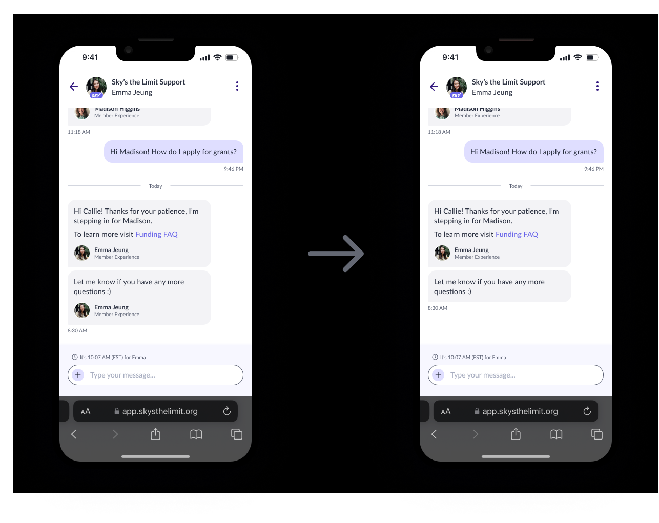
We conducted usability tests with the ME team to get feedback on the prototype. Based on feedback, we made a few minor updates to the design, such as removing the signature from consecutive messages sent within a given timeframe. The ME team often chats with members in real-time, and signatures would get annoying, considering the limited screen space.
Results
The solution helped the ME team more efficiently manage conversations and better understand the status of each one. This, in turn, has helped them respond to members more promptly and improve their overall processes.


